NTUA Portal Redesign
The redesigned platform empowers customers to effortlessly pay bills, track their usage in real time, and manage their accounts with ease, enhancing overall engagement and satisfaction.
NTUA’s portal is used by everyone from customers to agents and administrators. This case study focuses on the needs of commercial customers’ persona, hence redesigning the resident personapages of the portal.
Utilities
User testing & UI redesign
Challenge
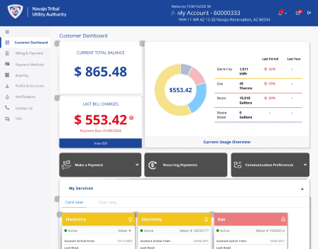
The app's interface was cluttered, making it hard for users to navigate and find important features. There were issues with setting up recurring payments, accessing services, changing account settings, and more. Overall, the portal felt outdated, dull, and required too much effort to use.
Results
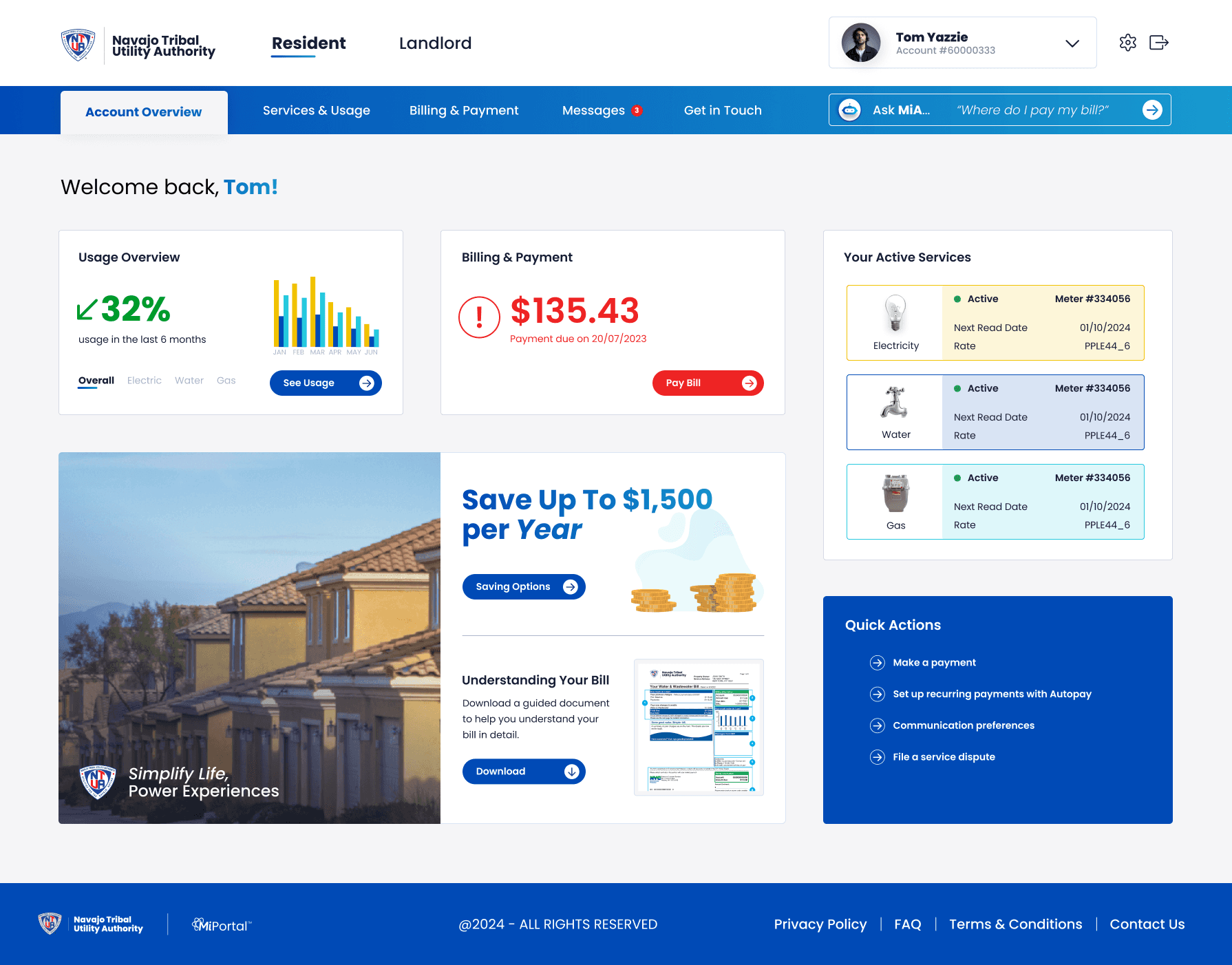
To address these issues, the solution involved a complete overhaul of the user interface. This included designing clearer navigation paths, reorganizing and streamlining the menu structure, and simplifying the user journey with a progressive reveal of steps.
The focus was on enhancing the overall user experience by reducing cognitive load, ensuring that key features were easily accessible, and creating a more modern, visually appealing design that improved both usability and user satisfaction.
10 Points
Increase in System Usability Score
30%
Quicker task completion
40/40
Full task completion

Before
Process
Research & Analysis: The process was achieved initially by conducting user interviews, SUS surveys, task completion rate and errors. This was done to understand the pain points and user needs. A competitor study was also carried out to analyze apps and industry trends to gather insights on best practices and contemporary design updates.
Information Architecture: Based on the results & findings, we restructured the app's navigation and content, prioritizing features and information according to user needs and the pitfalls they faced during the user testing phase.
Wireframing & Prototyping: We designed low-fidelity wireframes to visualize the new layout and navigation, iteratively refining them based on user feedback. Afterward, we built a high-fidelity, interactive prototype to test the design.
Usability Testing: We conducted usability tests with a diverse group of users to validate the design and identify areas for improvement. Based on the feedback, we made the necessary adjustments to the design.
Visual Design & Style Guide: We developed a cohesive visual language, including color schemes, typography, and iconography, ensuring consistency throughout the app. We also created a style guide to maintain design consistency in future updates.
Conclusion
The NTUA portal redesign successfully addressed the usability issues tested at first, resulting in a more intuitive and user-friendly experience. The improved UX/UI design led to quciker completion times, and a more intuitive, streamlined user experience.


